Monthly Archives: June 2016

Photographer: Ansel Adams

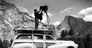
Having recently returned from a trip to Yosemite National Park I’ve been studying possibly the most famous photographer to produce imagery of Yosemite – Ansel Adams. His work is also extremely fitting for this part of my course – monochrome.

Ansel-Adams-Portrait-Inner-Banner1

Ansel Adams was an american landscape photographer, famed for his stunning black and white images of The American West. Together with Fred Archer he devised a process known as the ‘Zone System’.

The Zone System provides photographers with a systematic method of precisely defining the relationship between the way they visualize the photographic subject and the final results. Although it originated with black-and-white, the Zone System is also applicable to digital photography. Adams himself anticipated the digital image. As with color reversal film, the normal procedure is to expose for the highlights and process for the shadows.


For a full breakdown of this method click here to go to Wikipedia.

Adams also founded the photography group known as Group f/64 along with fellow photographers Willard Van Dyke and Edward Weston.

The New York Times published a great article on Group f/64, please click here to view it.

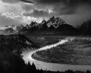
What struck me the most with Adams’ photography is just how bold and tonal his images were. They almost look processed. Being able to produce such sharp, moody contrasting images using the equipment available back in the mid 1930s is inspiring. It really has opened my eyes to just how much control photographers have over producing the visualised effect desired. It’s simply not a case of putting your DSLR into monochrome mode, or converting a colour image into black-and-white in post processing software. It’s about being conscious of the huge range of variables: tones, highlights, shadows, textures, form, shape, colours, depths, low key parts, high key parts…The list goes on!!

Adams_The_Tetons_and_the_Snake_River


5010114-u-2

adamslg

Exercise: Colours into tones part 2 (DPP)

The aim of this exercise is to make practical use of channel adjustment to achieve a specific effect. Choose one of the following:

  • A landscape in which you emphasise the depth by strengthening the visual effect of haze.
  • A portrait in which you lighten the complexion without significantly altering the tones of the rest of the image.
  • A picture of a garden in which the green vegetation appears light in tone.

In addition to this, for comparison, also prepare the default black-and-white conversion offered by your software.

Having just returned from a road trip through California I decided to go for the landscape option as I was lucky enough to visit Yosemite.

Here’s the default black and white version produced by Photoshop:

falls gray

Here’s the edited version:

falls haze

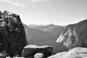
The exercise states we need to emphasise depth through haze. The changes are not drastic, but i’ve enhanced the visual haze which was already apparent in the original photograph (the midday sun was harsh and situated just to the left off the shot). By increasing the blue hues (blue, cyan and magenta) of the channel slider i’ve been able to add more haze, and open up the background. I’ve also slightly enhanced the tone of the forefront objects (the rocks at the very front of the image, and the cliff to the left of the shot) with these objects being clear and crisp, and the snowy mountains disappearing into the haze, we have a heightened feeling of ‘depth’.

It was impossible not to try and recreate an Ansel Adams-esque picture of Yosemite. His black and white landscape photography is so iconic that I just had to play around with my photos. I produced this edited shot of the above image:

falls edit

While I understand the aim of this exercise and the importance of adding depth using the haze technique, i’ve almost done the opposite for this image and have added shadows and highlights, resulting in a very moody and dramatic image. I’ve darkened the middle mountain significantly, and added tones to the sky – ranging from almost back to white. I lightened the rock to the left which adds form and texture and lightened the rock face of the mountain on the right. I think these different shades lead the eye from the initial rocks at the front, to the rock on the left, through the valley to the mid rock and then finally to the rocks in the centre, and the snowy mountains in the very far distance.