Produce a photographic image to illustrate an imaginary book or magazine cover. Covers are sales vehicles for their contents, and so are often quite widely interpreted by art directors, illustrators and photographers. The moral ground is therefore potentially ambiguous.
At first the assignment appeared to be fairly straightforward, and I had an idea of the direction I wanted to go in from the start. I wanted to illustrate an image that was loosely based around a theme of ‘Gangs Of New York’. It is not designed to be a book cover illustrating the 2002 film of the same title directed by Martin Scorsese.
I read an interesting article on the rise of girl gangs in The New York Post – http://nypost.com/2011/12/04/rise-of-the-girl-gangs/)
It was evident almost straight away that with this being such an open assignment revolving around interpretation and illustration that the possibilities for different designs were almost endless. I had a rough vision of what I wanted to create, and assumed I could replicate it fairly quickly. With so many versions available I quickly became overwhelmed with the amount of control and adaptations that I could create.
I wanted to push myself out of my comfort zone and actually took a self portrait (I much prefer being behind the camera) this in itself was no easy task. I wanted a side profile image which meant I wasn’t looking at the camera. For this to be achievable I set up my tripod and used a stand in model so I could set my focus. I then marked the model’s position with an ‘X’ and reached for my remote shutter. Once my camera settings were ready I posed in several different positions and snapped away. I wanted the ‘person’ in the image to be wearing a dark hooded top – as hooded tops are synonymous with crime and unsavoury individuals. I wanted the facial features to stand out and be bold, so I positioned the hood further back from my face. I upped the contrast on the face and brightened it as I wanted it to appear light and innocent; a technique that could help to represent someone who is vulnerable. The face is positioned looking up towards the sky as a way of demonstrating anguish, fear or uncertainty. This image can be interpreted as seeking help from a higher power. This is something for the viewer to interpret.
The next stage was sifting through my images to filter out the strong from the weak. I went through my workflow process as usual until I had found the image I wanted to use. I then made some minor tweaks/corrections to the self portrait. I decided to convert the raw image to black and white, and sharpened the eyes slightly. I also added noise as I did not want a crisp sharp image, but more of a grainy grungy feel.
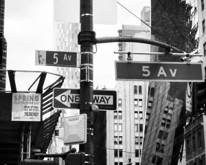
The next step was to find two other images from my personal archive for my book cover. I chose one of New York’s skyline, and one of street signs taken on the famous Fifth Avenue. The effect I wanted to produce was an art like fade of multiple images – almost in an overlapping collage kind of way.
I’d visited several book shops beforehand to study examples and found that while magazine covers tend to include multiple images, stories and sub stories, book covers tend to be much more simplified. They are eye catching, intriguing and simple. With this in mind I was very aware not to over crowd my image. I had decided to mainly go for very strong contrasting black and white shots, enhancing the feeling of isolation and removing any kind of aesthetic ‘warmth’.
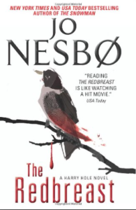
Here’s several examples of the kind of styles I was concidering, and book covers that especially caught my eye:
As you can see, all of the above examples are simple, and fairly understated in that they are not crammed full of detail. Several of them include a double exposure effect and have a stark white background. I like the use of the side portrait silhouettes also.
I converted the skyline image to black and white, and replaced the cloudy sky with a stark plain white sky. This removed any distracting detail from the sky.
I added film grain and a slight blur to the sign post image to enhance the ‘grungy’ feeling. I wanted to capture the ‘rough’ image of New York – and by using bold black and whites I feel this is achievable.
I then had to use multiple layering techniques in Photoshop to produce the final image. I put the skyline image in the hoodie itself, and then layered that over the sign post image. I didn’t want to fill the whole frame so I removed certain parts of the sign post image to create an arty aspect. I wanted the girls eye-line to be pointing in the direction of the ‘one way’ sign as a way of symbolising a sense of direction, perhaps bad. Using blending techniques I was able to select certain areas I wanted to expose, and areas I wanted to hide. I also added a slight scratch effect to magnify the edgy/grunge feel.
I decided to add a pink hue to the image. I wanted the overall image to feel somewhat cold, but having just black and white was far too clinical. I added pink to the back of the hoodie for several reasons. Firstly, to make it more eye catching. It’s subtle, but the presence of colour makes it much more interesting. Secondly, as pink is universally associated with females I thought it would help to imply that it’s a girl gang. Thirdly, I think it helps hold the shape of the hoodie outline.
My aim was to create an illustration or a piece of art, rather than a manipulated photograph. I wanted to remove all likeness of the original photos in their raw state and use them to create an end product that did not look like a ‘photograph’. By manipulating each image almost to beyond recognition (to the originals) I feel it maintains a standard of ethicality. Doctoring photographs is a general ‘no’ in the world of photography, but by pushing the limits to the extreme it ventures into the world of art and illustration. None of the original photographs are still a valid visual representative of their subjects, apart from the self portrait, where the face is clearly still visible.
The more you look at the image, the more details you can see. One of my favourite parts is the traffic lights on the edge of the hoodie by the tip of the Empire State building. I also like the very discreet second ‘5th Ave’ sign hidden behind the eye. I wanted the face and facial features to be soft and ghostly, perhaps even angelic. In keeping with the ‘gang’ theme I applied a noise filter which is evident on the ‘One Way’ sign especially. This has achieved the grainy/grungy feel, but has perhaps made the face appear slightly soft. However, as I wanted the facial features to appear angelic, I think this has helped in that aspect.
It could have been very easy to get carried away with this assignment, as it’s such an open ended objective, but I’m extremely happy with the outcome of my work. There’s enough detail to make it interesting, yet not overpowering. Taking the photographs was the easiest part. The blending and layering technical side was very intricate. It just goes to show what you can do with software manipulation.
Here’s the three original images I used:
Assessment criteria
As part of the assignment, I am required to assess my progress against a set of criteria points.
Demonstration of Technical and Visual Skills materials, techniques, observational skills, visual awareness, design and compositional skills
My technical skills were paramount to this module. Thankfully I already had an understanding of post-processing and was familiar with software such as Photoshop. I felt fairly confident from the start of this module. While I used 2 images from my personal archive, the self portrait pushed my technical skills and revolved around precision positioning, focusing and timing. It was not as simple as ‘point and shoot’. While I’ve researched fellow photographers and styles I admire I’ve tried to create my own style with this assignment, rather than perhaps loosely re-creating a style I’ve seen. I feel much more confident in both my photography and my editing skills.
I find it almost second nature now to have a vision of the end product before i’ve even begun shooting, and therefore follow my workflow better and produce an image I’ve pictured mentally and worked towards achieving, rather than ending up with something that started off as I had visualised, but stumbled across problems or setbacks and had to be tweaked/altered. My work is not so heavily based on improvisation.
Quality of Outcome content, application of knowledge, presentation of work in a coherent manner, discernment, conceptualisation of thoughts, communication of ideas
I’m gradually building up my learning log with work I admire, photographers my tutor has introduced me to, and techniques I’m trying out. The most recent being the long exposure shots using a sheet of welding glass. I could do with putting more of my personal photography on perhaps, which is always developing my skills and creativity. I think my blog is easy to navigate, and set out in a clear simple manner.
Demonstration of Creativity imagination, experimentation, invention, development of personal voice
I think my imagination and creativity have really shone through on this assignment. With such an open ended brief it has meant we can produce almost anything we like. There’s no context to follow – it doesn’t have to be black and white, or a landscape shot, or a portrait etc. I’ve experimented with taking a self portrait which I’ve not really done before and I feel like my creative style is really apparent in the final image. In previous assignments I have sometimes gone for a very literal approach in tackling my brief, and have held back on my creativity, but I think this module has helped to build confidence in this area.
Context reflection, research, critical thinking (learning log)
Particularly in this module I’ve studied the history of photography, and studied older photographs and genres (looking at image manipulation throughout the history of photography). I’ve bought several books to get started on (again on my tutors advice) and am not just studying modern contemporary photography which seems to be what I’m naturally drawn to (street photography, striking landscapes etc). Sometimes I doubt my intuition and feel like I need several interesting factors in my image to make it stand out (for example, light trails on a busy street, lots of movement, colour etc), when some of the most thought evoking and impacting photographs are very simplistic. (Valerie Jardin’s shot of a man reading his book which I wrote about in a previous post is a great example of this.)
I do think I still need to play around more with interesting angles, even if this does mean lying down in the middle of the pavement on Oxford Street…


