Part 1 to produce one photograph for each combination of primary and secondary colours that follows the rule of proportion as proposed by J.W. Von Goethe.
Part 2 produce 3 – 4 images which feature colour combinations that appeal to me. Be aware of any imbalance in the combination and study its effect.
The OCA course notes have introduced a colour ratio theory proposed by a German poet and playwright J.W. Goethe. Goethe has assigned the following values to the six colours: yellow 9, orange 8, red and green 6, blue 4 and violet 3. For the first part of this exercise we are required to show the ideal proportions for how much colour occupies the frame, which are:
Red:green 1:1
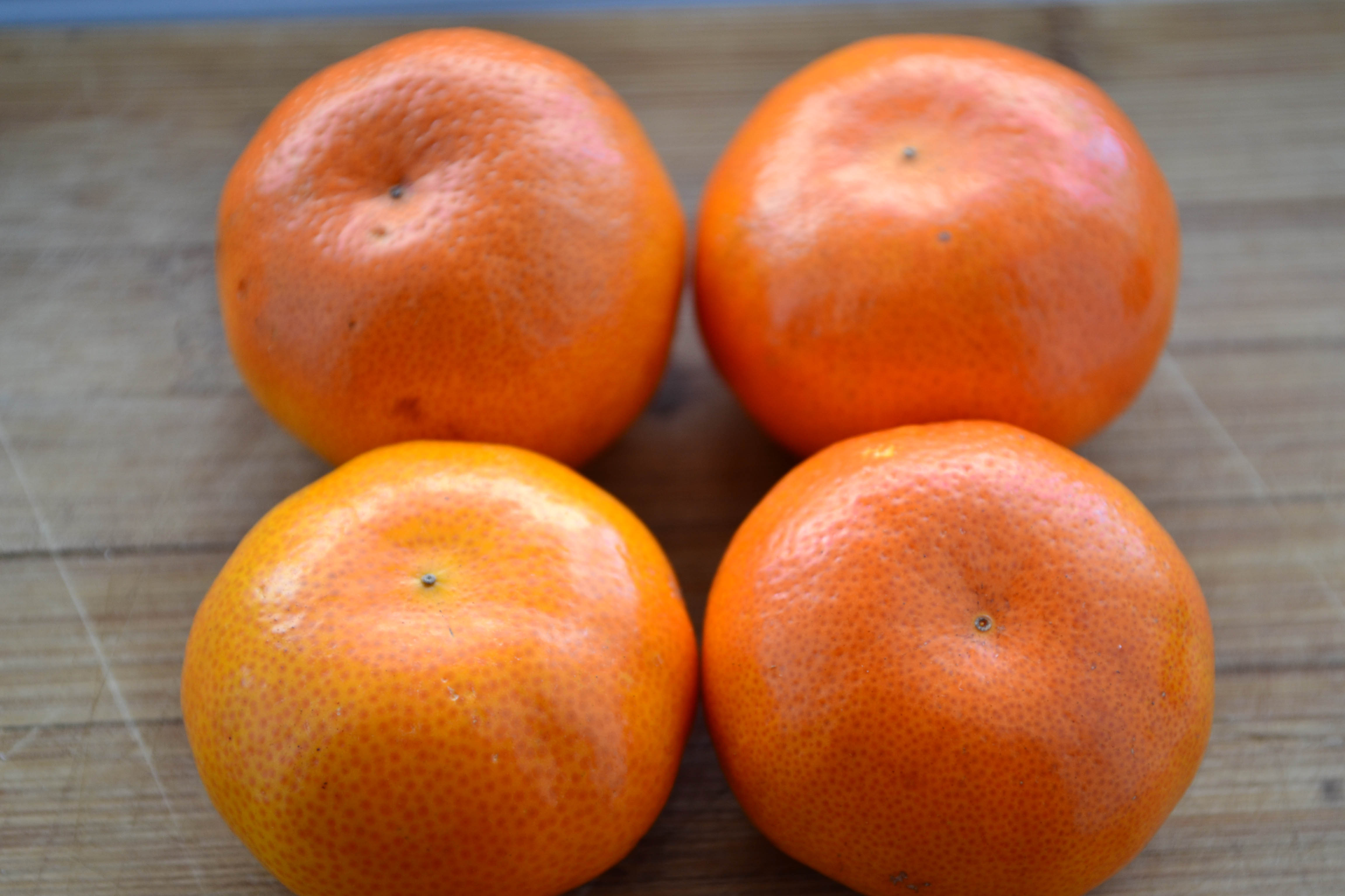
Orange:blue 1:2
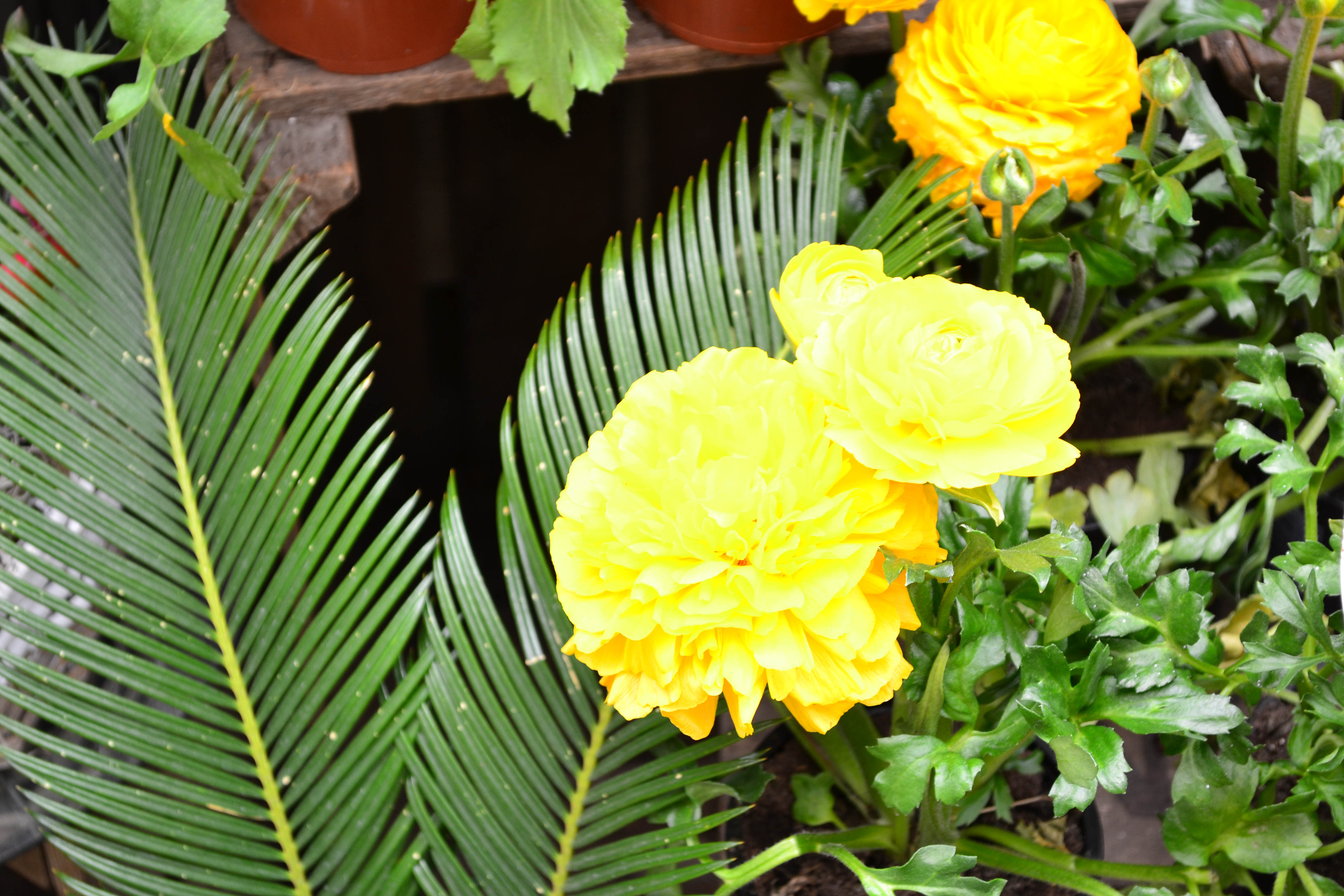
Yellow:violet 1:3

The red flower is slightly prominent in the image allowing for more green to be included within the background to make the ratio even. I was conscious not to have an image that was two objects of the same size and shape next to one another. Getting the focal length correct to produce an even ratio in a less obvious arrangement required several shots.
Again for this image I wanted to try to find a scene that wasn’t too obvious – a sunset would have been a fairly easy shot in regards to finding the correct ratio (the timing of a sunset can result in a vast range of ratios). I chose a shot that did not include a plain blue background to make the image a bit more interesting.

This was a hard ratio to find. Nature wise my best bet was flowers but i was quickly running out of time and did not want to use flowers twice (as i had used them for red:green). However, i think this does meet the objective but is fairly uninteresting.
For part 2 i chose the following images that caught my eye in regards to the colours:

It is instantly noticeable that these colours clash – yet it is such a striking piece of street work and I feel it works really well. The main colours (red, pink and purple) are found next to each other on the colour chart and therefore should not be regarded as balanced. There is yellow and orange in the image which again are next to red and violet in the chart. With the addition of some blue and white it counter acts the red/purple hues to an extent. This is an excellent example to contradict the rule of colour relationships put forward by J.W. Von Goethe stating ‘using two opposing colours in an image helps achieve a sense of harmony’ as i often regard colours next to each other together can be very harmonious i.e groups of blues and greens.

Here is another example of 2 colours found next to each other on the colour wheel. In theory, the picture should appear slightly imbalanced but this is not the case. This may be reduced in result of the neutral skin tone colour adding balance as orange/red (i.e a fleshy hue) are opposite blue and green, thus supporting Goethes theory.

This piece of street art uses opposite colours which support the colour wheel rule, but the ratio’s are unbalanced. Goethe proposed that orange and blue should have a ratio of 1:2 therefore more blue than orange. However this shot shows an almost equal amount of the 2 hues, yet appears balanced. The artwork appears to be 2 ‘Bluebirds’. Bluebirds have a orange/blue ratio very similar to that in the photograph and it may be because the eye is seeing a replica of a real life object, it processes it as balanced, as it is familiar.

In regards to this image the colours are all over the place! It includes every single colour from the colour wheel – red, yellow, orange, green, blue and violet. It immediately caught my eye simply because it is SO colourful. Do I think it is balanced? I’m still trying to come to a conclusion! With so much going on it is a lot for the eye to take in and process, but i feel that the lower word “owed” has harmony – again it uses colours that are next to each other in the wheel (blues, pinks, reds and oranges) Having said that – the top word “dietism” uses opposite colours therefore producing the textbook definition of harmony. I am really glad that i managed to find something including all colours as i wanted to study the effect that this would have.