Monthly Archives: October 2013

Exercise: Cropping (TAoP)

Objective: To select 3 of my own photographs and experiment with different ways of cropping.

This exercise seems like a pretty straightforward one, and I’m always looking at different crops when editing my pictures.

Here are a few to demonstrate.

This shot is sunrise at Santa Cruz beach. This is the original.

santa cruz sunset


 sunset crop 3 

sunset crop 1


The next is a stain glass church window. Below is the original.

IMG_1482


window crop 1

Here is the original image of some children I met in Cambodia.

cam kids

cam kids crop 1

cam kids crop 2


I thought this crop works well as the first two children are exited and confident, while the children on the right are wary and more reserved resulting in 2 completely different images.


Exercise: Fitting frame to subject (TAoP)

Objective: To demonstrate and experiment with how much space a chosen subject takes up in the viewfinder.

For this exercise i have to take 4/5 different pictures of one subject. The first picture should include the whole of the subject in the viewfinder, and should be taken without too much consideration for composition.

no composition

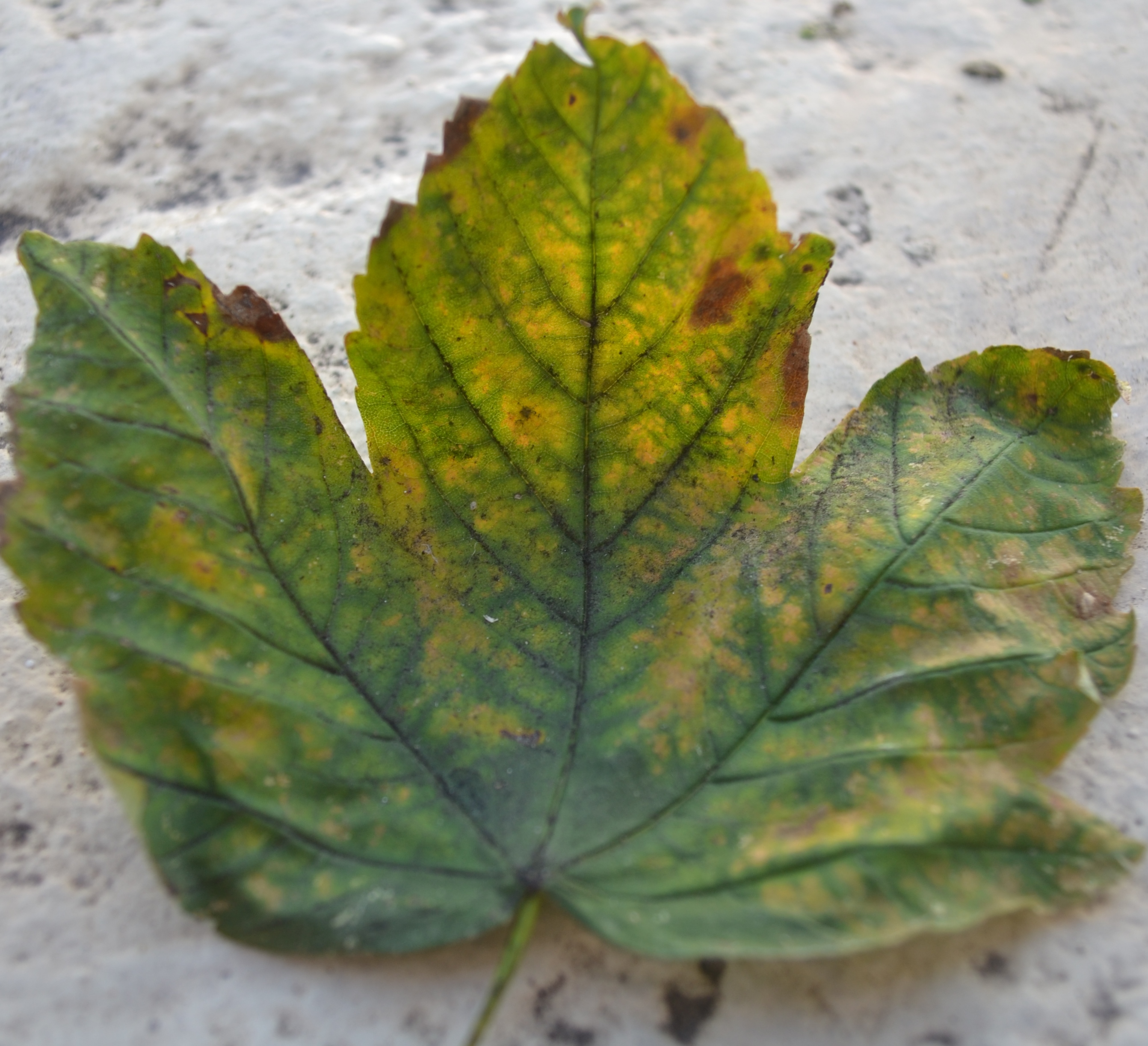
The second shot should move in and around making the subject fit the frame as tightly as possible.

leaf to edge

I used a wide aperture setting for these pictures. As you can see by the picture above the edges of the leaf are slightly blurred. This is a direct result of the low f stop number.

The third picture was to photograph just a part of the subject. (ideally it should not show any edges – however, my standard lens could not capture the detail effectively. I could crop it, but I feel that defeats the exercise. This highlights a problem with using a small subject – had I used something bigger i could have captured more detail within a part of the subject.)

part of leaf

That being said – I like this picture. The wide aperture makes the ledge blurry, focusing the attention on the left tip of the leaf – the main focal point. I am happy with the detail captured.

The next picture should place the subject within a landscape.

backgrnd 2

I took this shot vertically as i wanted to incorporate the rising sun. I am pleased with the way the tree in the background came out (again due to the wide aperture) as it completely relates to the subject and adds depth and colour.

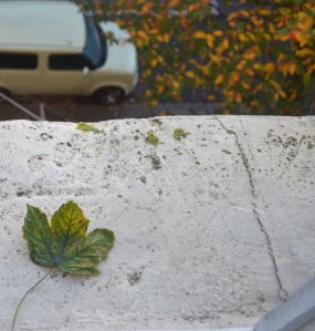
The final picture was to move right back until the subject occupies only a small part of the frame and stresses the surroundings.

leaf less than quarter

To stress the surroundings I roughly placed the single leaf in between two trees – both with colourings mirroring that of the subject. The car was out of my control unfortunately – but I decided to shoot the leaf slightly off centre between the trees to add depth. The light couloured ledge helps to attract attention to the subject.

Overall I’m happy with the results but would like to attempt this exercise with a much larger subject. (the handbook uses a ferry to demonstrate) so will head to one of the many London bridges to see what i can find…

The final stage of this exercise is to play around with different cropping ideas.

crop 5 crop 4 crop 3 crop 2

Exercise: Positioning the horizon (TAoP)

Objective: To experiment with the position of the horizon and noting what effect this has on the frame.

Due to the recent storm I have chosen an archive picture taken in New Zealand. I love  the landscape of New Zealand and this picture captures its rural green hills and gorgeous blue waters side by side.

The first image is the original.

horizon

The horizon is above the middle of the frame resulting in the focal point being the trees in the centre of the ‘dip’ and also the rocks to the right of the frame. There is plenty of depth in this picture as you can get a sense of the slope towards the water.

crop 1

With the horizon (mountains) now completely centred your eye is drawn directly to them. This makes the clouds more noticeable as well. The greenery and trees still add effect without being too distracting. I prefer this image to the first and it is probably my favourite from this exercise. However, it could be noted that there is perhaps a bit too much sky in this image.

crop 2

With the horizon now at the top of the shot it feels restricted and cramped. The hillside and trees are the main focal point, resulting in the horizon almost going unnoticed.

crop 3

This final shot has a ‘panoramic’ feel about it. I think the greenery and the blue of both the water and the sky completely balance one another. However, with the horizon being very near the top of the image i think it feels slightly squashed again. With this in mind i have cropped what, in my opinion, is the best balance of colours and horizon positioning.

crop 4

Exercise: Shutter speeds (TAoP)

Objective :To demonstrate how shutter speed effects movement. Altering shutter speed also determines the levels of sharpness obtained.

For this exercise i selected ‘S’ mode on my Nikon. This is ‘Shutter priority’ mode. I have a range from 30 (1/2 a minute) to 1/200 (200th of a second) with the standard camera.  (This can be increased using high speed flash sync to 1/4000th with compatible flashguns.)

Initially I intended to use a fountain as my subject but due to wisdom teeth problems and thunderstorms i decided to use a closer, easier object instead as i wanted to stick to my deadline and not fall behind on further projects.

I will however be re doing this exercise as planned, but for now i think I’ve demonstrated the objective of this exercise.

I have chosen the following pictures that best represent the difference between shutter speeds. these were shot at 30, 6, and 1.6, to demonstrate a long shutter speed and 1/60, 1/125 and 1/200 for the fast shutter speed. The ISO remained at 400 throughout.

30 seconds

30

6 seconds

6

1.6 seconds

1.6

1/60th of a second

1.60

1/125th of a second

1.125

1/200th of a second

1.200

As anticipated, a longer shutter speeds makes the water look silky and soft, almost creamy. The short shutter speed captures the water more dramatically resulting in a much sharper image.

I have also noticed that a longer shutter speed shows the background in more focus, whereas the later shots at 1/125 and 1/200 have blurred backgrounds. The background starts to be out of focus around 1.6 of a second.

There were a few issues I faced with this exercise. In theory it was pretty straight forward but i hadn’t taken into account the flash bouncing off the ceramic bath surface, the white background behind the water (my results may have been more noticeable if there was a different colour behind the water – especially for the long shutter speed shots) and the amount of light. For the long shutter speeds I had to turn off the bathroom light and take the pictures almost in complete darkness. I would like to see how this exercise would turn out if I used an outdoor setting with a constant light source. The built in flash became necessary at 1/30 making the pictures look very different to the shots taken with a long shutter speed.

My favourite image is the 1/200th. I love how the water looks sparkly and sharp and the contrast is vivid. It feels much more ‘artistic’ than the other shots.

Larry Yust

Larry Yust is one of my favourite current photographers at the minute. I have only just stumbled across his work and I absolutely love it. I am a big fan of photographing graffiti and streets and I find his work extremely inspiring. I really like how vivid the colouring in his work is.

LY street Paris, France. Courtesy of Larry Yust. LY ven Berlin, Germany. Courtesy of Larry Yust.

Many of Larry Yust’s pictures are created using ‘Photographic elevation’.

What is a Photographic Elevation?

A Photographic Elevation is not a panorama  which is photographed from a single, static point of view, and in which all objects not directly in front of the camera are distorted.  To make a photographic elevation, Yust walks or rides along a path parallel to the subject being photographed, snaps overlapping shots of it with his camera always pointing directly at the subject, and then puts the shots together in a computer.  The resulting images are essentially free of perspective and cannot be achieved in any other way.  They provide a new way of looking at the world.

http://www.larryyust.com/sample-page-2/

Exercise: Focus at different apertures (TAoP)

Objective: To demonstrate how aperture affects the depth of field. 

For this exercise I have to focus on one spot within the frame, but change the aperture settings. I focused on the middle area of the image (mainly the fret board). My aperture range is between f5.6 to f22. I stayed with the same subject as before (my guitar) but included a bit more detail to each frame as a way of measuring how much comes into focus and at what aperture.The idea of the exercise is to demonstrate that a wide aperture of f5.6 will have a shallow depth of field, whilst an aperture of f22 should have depth ranging from front to back in the image.

I shot 4 images at f5.6, f7, f13 and f22. These settings were the best in order to highlight my results.

f5.6

This image taken at f5.6 has a very blurred overall feel, with only the middle of the fret board in focus.

f7

At f7 the guitar body is much more focused and you can start to distinguish more detail in the background i.e. a cable running up behind the left curtain and a small black spot under the window frame.

f13

At f13 there is a significant difference. The folds in the curtains and the cable are becoming much sharper, and the black spot is more noticable. The guitar is in full focus.

f22

The final image at f22 is in full focus. The curtain folds are sharp and detailed. I feel that the reflection in the window on all images is distracting and blurry. However, i was reluctant to crop this out as i wanted to include the folds in the curtains. This was a result of not using a tripod for the last pictures in particular as the shutter speed was significantly decreased. I would like to re do these shots when my new tripod arrives 🙂

Exercise: Focus with a set aperture (TAoP)

Objective: To show how changing the focus point with an aperture set at its widest affects the picture and make a choice as to which is the preferred image.

For this exercise I have chosen f5.6 as my fixed aperture as I feel it worked very well.

My subject is a guitar fret board shot from a slightly raised angle. I tried this exercise with a row of books but felt that the different font styles, colours and font sizes added some confusion to the final picture and were slightly distracting. I chose to use black and white photos for my final selection as I feel it helps to demonstrate the objective.

The first picture is focused on the nearest few frets.

Cropped near focus

Photo 2 is focusing on the centre frets

Cropped mid focus

The final photo is focused on the last frets

Cropped far focus

As I expected, anything that is not the at the centre of focus is blurred. The photos are fairly basic – there is nothing in particular that could distract the eye (perhaps the strap to the left of each image) – no background objects or colours, and the positioning of the camera almost turns the fret board into a runway. Your eye is led directly to the centre of focus.

As for choosing my favourite image, I think it has to be the far focus picture. The area in focus is directly in the middle of the whole image whereas the near focus falls right at the bottom of the image rendering the rest of the picture quite useless as it is just a lot of blur. You can almost make out the tuning heads on the far focus as well – making the subject more apparent.

I would like to experiment a bit more with this exercise and have different objects in the background to measure just how blurry they become at different focal ranges and use colour too, but for now, I think the images portray the objective.