‘The World Through A Screen’
I’ve done a great deal of planning for this project such as subjects, locations, sub-themes and the inspiration behind my choices. My initial idea was to create a set of photographs based around ‘pictures of people taking pictures‘ or ‘seeing the world through screens‘ and my inspiration came from every day life. So often on my commute I see people glued to their smart phones, and the need/desire to own a camera is dwindling as so many of us can rely on our phones. With numerous apps and editing software even the most un-photographic people are producing some great images. This is largely evident on social media, especially Instagram (www.Instagram.com) where people photograph everything; from breakfast, to clothing, to cocktails, to landscapes. The ability to produce aesthetic photographs with very little knowledge or equipment is on the rise.
I’m not being critical towards social media – I myself am a huge fan, and rely on social media to get my work seen – it’s enabled me to reach a far greater audience than I’d ever be capable of myself.
Nowadays people really are capturing every moment. Technology is so advanced that an inbuilt camera within a phone can create stunning imagery. There are sites dedicated to iPhone photography, and numerous Instagram users have found fame through such avenues.
Why we feel the need to photograph our entire lives from lunches, our journeys, our outfits and so on is baffling. It seems as though we are searching for some kind of positive re-inforcement that we lead exciting lives, that we keep up with fashion, and that there’s a sense of social acceptance attached to social media ‘likes’. It’s a dangerous avenue for the youth of today.
Living in London I see tourists on a daily basis snapping away with their phones. Whether it’s The London Eye or Big Ben, almost everyone has instant access to a photographic device that’s small enough to slip into a pocket.
With that in mind I wanted to capture a first person perspective of taking a photo on an iPhone (this seemed more challenging than just photographing people in the middle of taking photos) but as this module focuses on editing I’ve chosen to incorporate some subtle and not-so-subtle ‘tweaks’ as it were. Research wise there were several examples of what I’d like to loosely base my project on, but I did not come across anything similar by a photographer in which to reference.
Big Ben
From the outset I wanted to horizontally flip the image that would be shown on the iPhone screen, which may not be instantly apparent when first viewing it. This shot provided several obstacles for me:
Firstly the bright sunshine was very strong on the left hand side of the image, which meant my model (my arms simply aren’t long enough) had to tilt the screen a fair amount to avoid glare off the front of the screen. This meant the phone display was in the shade and was hard to take meter readings from that didn’t result in the background being blown out.
What I eventually did was edit in a photograph onto the front of the display, and add the phone icons to the front of the phone. So, this image actually uses two separate images.
I used a fairly wide aperture as I wanted an artistic subtle blur to the background, but I didn’t want it so blurry that you couldn’t make out the impressive architecture.
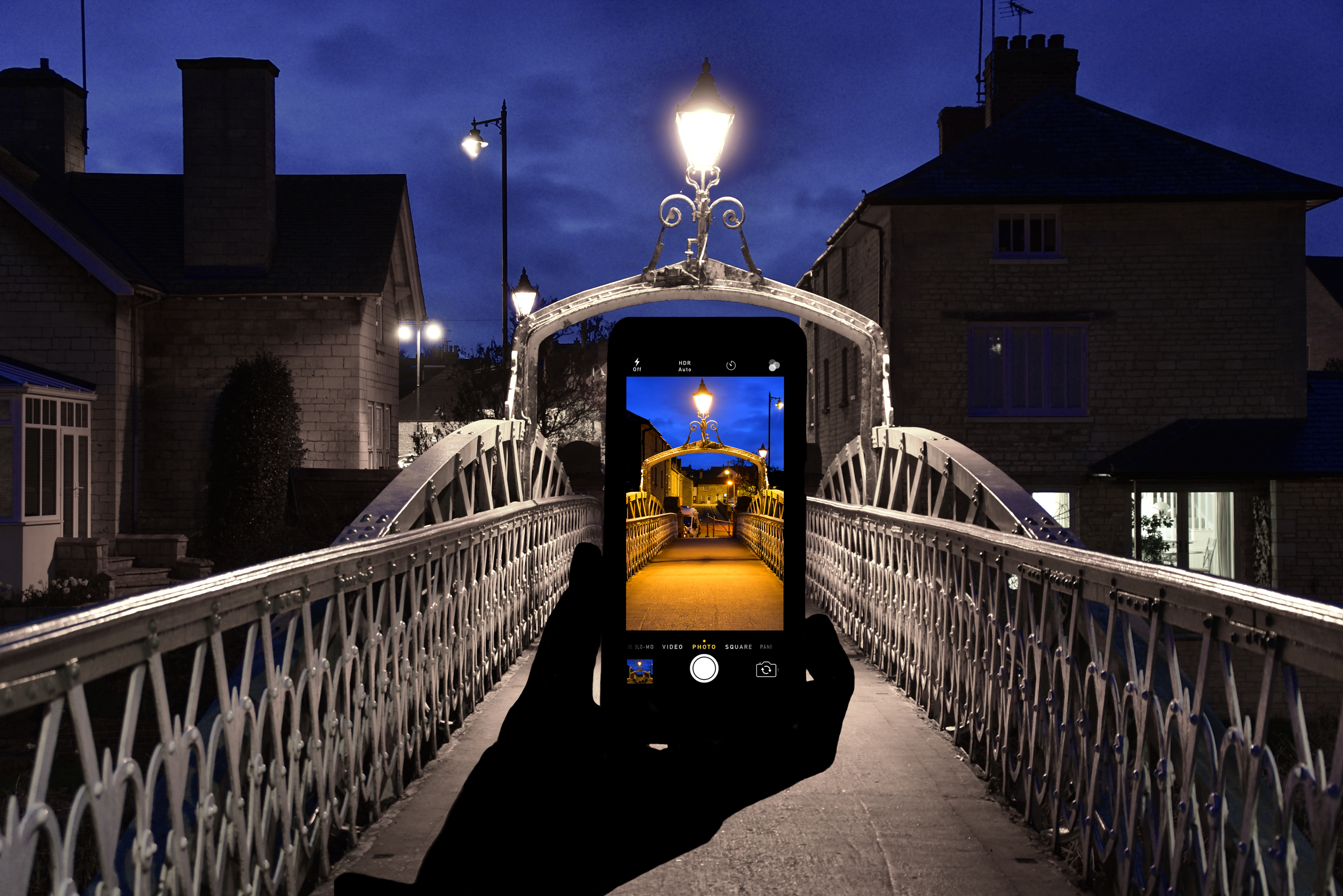
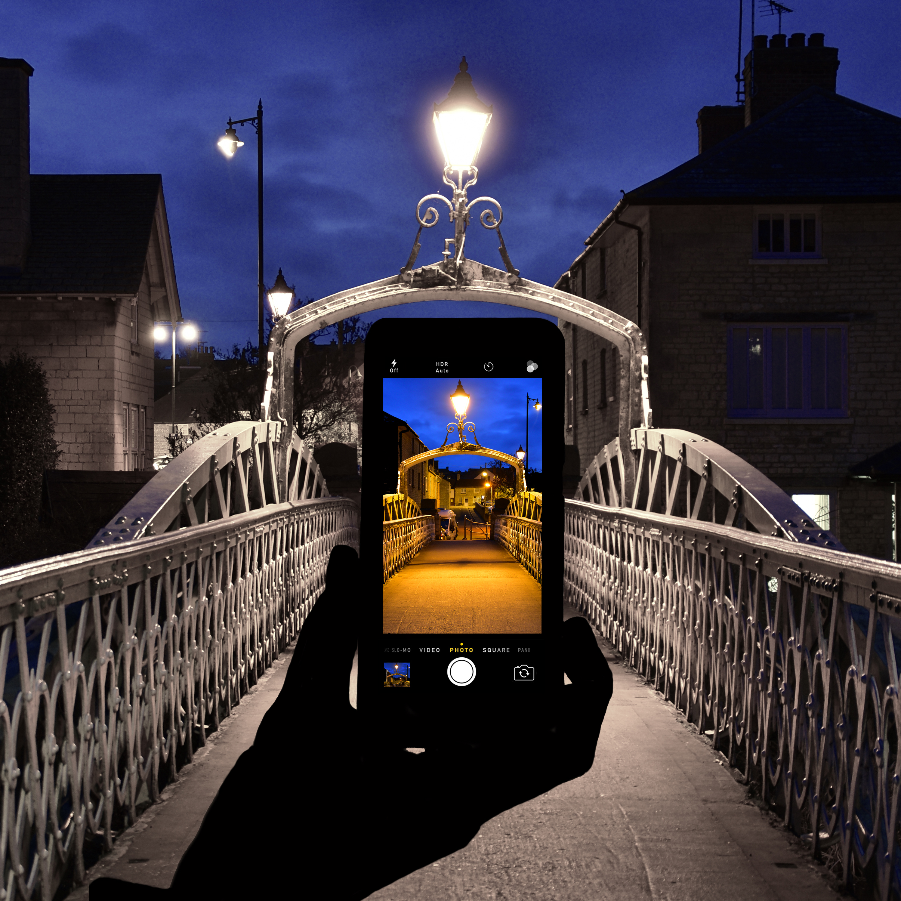
The Albert Bridge, Stamford

This small town bridge has a beautiful old fashioned light in the centre of it, which I wanted to incorporate. The metal of the bridge is white, and I wanted to extend on this in contrast to the orange hue given off by the street light. Again, this image uses multiple pictures; there are in fact 3. The background image of the bridge has been edited to enhance the moody feel of the sky, and render the other details in the picture almost black and white. I wanted the white of the bridge to be very prominent. The silhouette of the hand holding the phone is the second picture. I had tried to capture this shot organically, but it was just too difficult to have every part I wanted, correctly exposed. Originally I shot the hand with the flash on, as I thought this could give an interesting effect. However, in the post processing phase it looked far too ‘fake’ when applied to the background picture using layers. I also decided that I wanted the centre of the image to be the main focal point, and the flash shot hand was too distracting. So with this in mind I converted the hand to a silhouette, bearing in mind it was a night shot; I think this adds to the eerie mood of the photograph. My tutor mentioned that I should perhaps re-shoot this image with the hand slightly illuminated, but I wanted the hand and its features to be totally void in both this shot and ‘Paused in Motion’. With it being in the centre of this image I think the silhouette effect helps draw the eye to the phone screen. It is evident that a hand is holding the phone, but it is in no way distracting. As this shot and ‘Paused in Motion’ were both shot at night, the blacked out hand helps to amplify this.
The third shot was taken on my DSLR and it is of the bridge view itself. I set my white balance setting to tungsten to really grab the orange hue. By taking all 3 photos in a fixed position I was able to line up the sides of the bridge to go from one picture to another with relative ease. The bridge appears far longer than it actually is, and the sense of continuity is very apparent in the shot. The keen eye will detect that one of the images has again been flipped – it was the background image. I wanted the more modern lamppost to be on the opposite side of the iPhone image to balance it out slightly. Again, I added the phone icons at the final stage of editing.
I wanted all areas to be in focus, so used a small aperture.
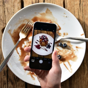
Going, Going, Gone
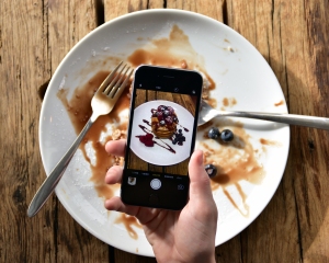
This image is one of my favorites. It was relatively easy to do, and I had quite a lot of control over it. (lighting, positioning, the appearance of the pancakes in their full state, the appearance of the finished plate) Again this image uses 2 photographs. My technique differed slightly with this shot – it was one of the first ones I created for this series and the phone photo was actually taken on the phone, rather than edited in later. To get the icons I actually took a screen shot of the pancake plate, as this photographs the whole display of the iPhone, not just what’s in the viewfinder on camera mode. The only downside to this was that the screenshot is lower quality. However, looking at the image as a whole this is not apparent.
I was careful to photograph both pictures using the same orientation of the background surface so as to add to the continuity of the shot. I then ate the pancakes, and created the messy after plate!
I positioned the plate by a brightly sunlit window and snapped away, and used a mid-range aperture.
Bloomin’ Trickery

Again, this was one of the first in the series, so my technique was fairly new. The photographic surface remained the same, to add continuity. I also positioned the model at an angle that would keep the grain in the wood running the same way. I did however, take the photo of the daffodils on my DSLR later editing this onto the front of the phone screen. I added the icons to the front of the display. The edit is clearly obvious, using 2 different types of flowers. Using the same surface for both pictures and lining up the grain of the wood helps in some way to retain continuity.
Maybe it’s Maybelline…

This image is one of two images that were taken organically, in one shot. It was fairly simple to do, using natural lighting and a wide aperture. I wanted a ‘tongue in cheek’ feel as the selfie craze seems to have taken over in recent years. I wanted the model to be almost one big giant blur as this draws your eye to the front of the phone screen. The sunglasses break up the face in the background. Had they not been worn I would have used less blur. The only change I made is obviously the lips. While at first glance it may look like the lipstick has been painted on in post processing, this is the real colour of the models lips. I desaturated the whole image, excluding the lip area.
Black and white images with only a splash of colour are a great marketing technique as they focus solely on a certain part of the image.
In Full Bloom

For this image I used a stock photograph courtesy of Google images (http://www.google.co.uk) of a single tree in full bloom, on a gorgeous sunny day. I then visited numerous locations to try and find a background setting that would/could incorporate the tree smoothly. Initially I had the stock image on the phone itself, but again came across some metering difficulties, so I added the stock photo in post processing. I added the phone icons, and made the background picture look more gloomy by decreasing the saturation somewhat, and altering the shadows and highlights. By lining up the grass level on the horizon, this image has the feel of continuity.
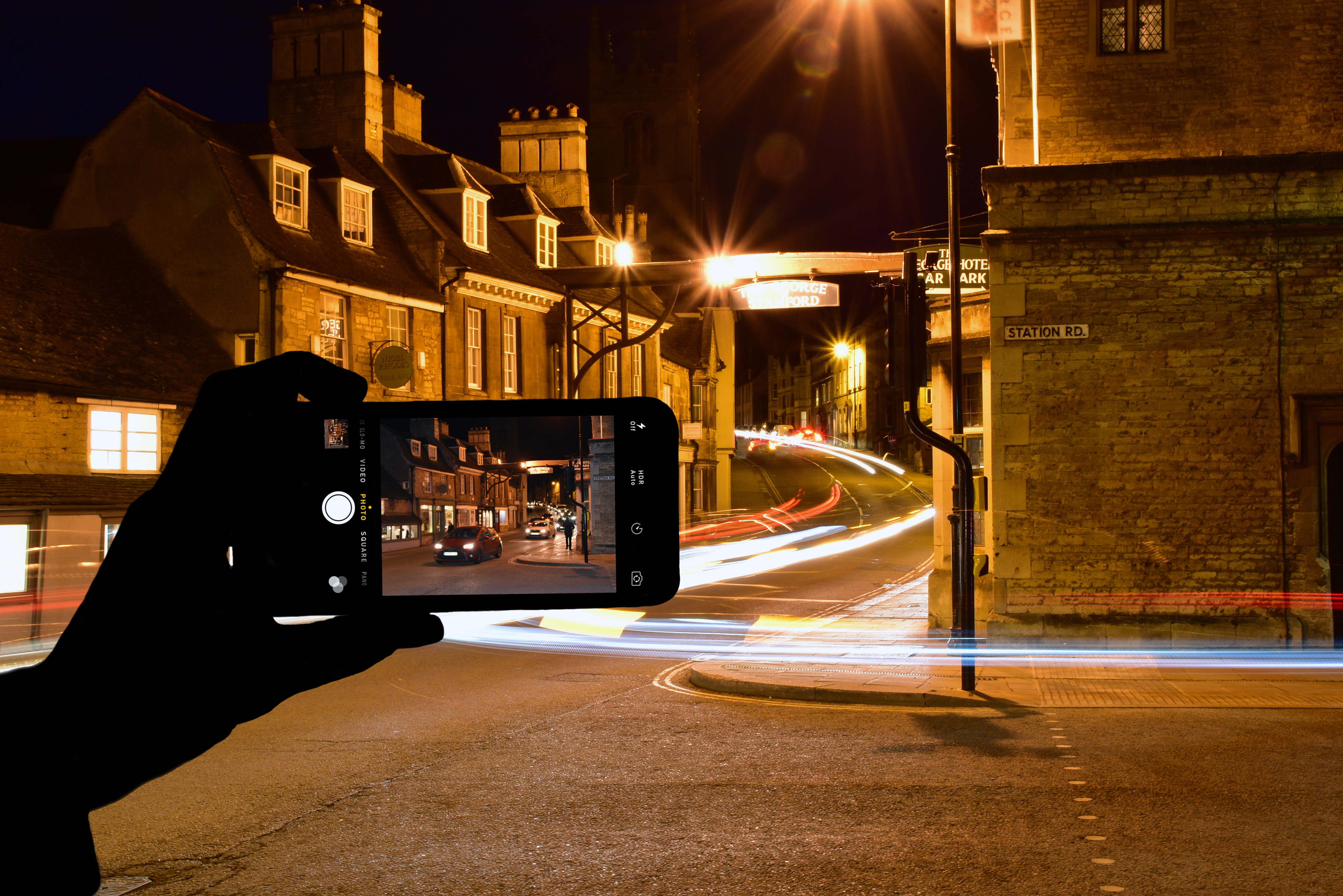
Paused In Motion

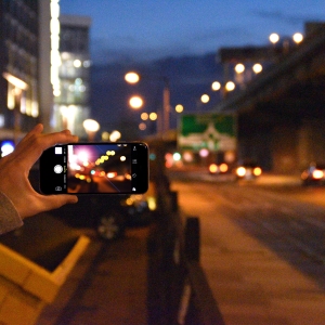
This is technically my best shot I think. Much like the other nighttime shot it actually has 3 separate photos in it. The background shot is a long exposure shot, and had a shutter speed of 30 seconds. Any longer and the traffic beam trail wouldn’t have been so obvious (it was shot in a fairly quiet area of my hometown where traffic is not a guaranteed constant) It was a stroke of luck that one of the cars turned left – creating the blur on the right hand side. As with the bridge photograph I decided on turning the hand into a silhouette. I really think it enhances the night feel, and doesn’t warrant too much unnecessary attention. Again, the phone icons were added in the post production stage.
The image that I edited onto the phone screen was taken from exactly the same angle, only with a much quicker shutter speed to pause the cars in motion.
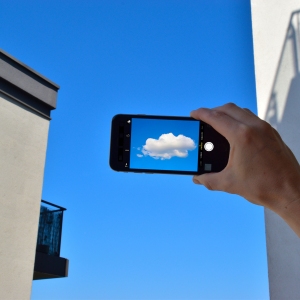
Every Cloud…

I love the simplicity of this shot. I didn’t want just a plain blue sky and the one cloud, so opted for a location that would give some strong abstract angles to add some interest to the shot. This shot took a while to create – mainly because I had to wait for a day of pure sunshine! I did not want to edit out too much of the sky or remove unwanted clouds.
Editing wise – I rammed up the vibrancy to produce the gorgeous vivid blue hue and also to match the blue of the stock photograph I got from www.google.com of the cloud. I wanted the colours to be as identical as possible to make it appear as if it could actually be there in the sky.
I used a wide angle lens so I could squeeze in the tall buildings around me, and place the cloud in the centre.
Brentford Bokeh

Brentford was once an industrial area, home to huge factories and warehouses. Although recently undergoing a huge makeover – there are still several areas that have an industrial feel. I wanted to incorporate this grungy feel in this photograph. Once I found my location I shot the background shot on a relatively high ISO to add noise to the image. I was lucky enough that a skip had been moved to the location – enhancing the industrial feel.
I then took a ‘bokeh‘ shot of the traffic lights and added this into the phone screen along with the icons. To add to the aesthetics of the picture I’ve added a small lens flare effect to the phone display image, and blurred the colourful lights some more. I wanted the image on the phone to be a continuation of the overall picture, and with the traffic in the background of the main image I feel this has been established.
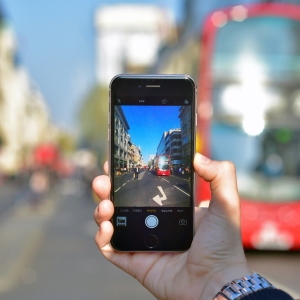
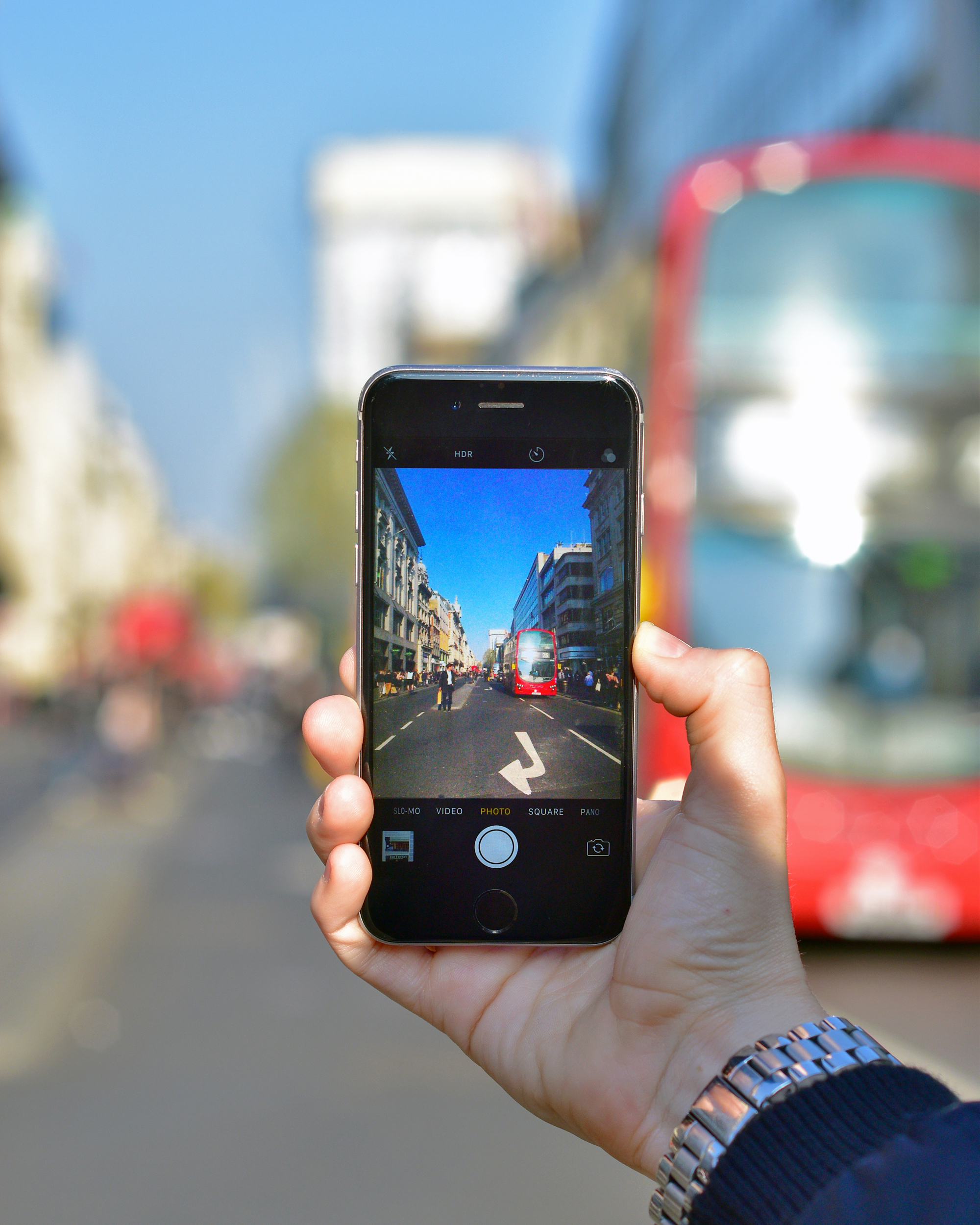
Street Life

This shot was taken whole. The phone display has not been altered in any way. I really like how the arrow of the street markings came out on the phone display. Due to the location of the shoot I had to be quick – which was rather exciting considering the volume of traffic on Oxford Street! The quality of the phone display is somewhat weak – but this is to be expected when taking a photo like this. I wanted to make sure I had included at least one outdoor shot that was taken naturally. Editing wise I’ve had a play with the contrast to make the red and blue within the display ‘pop’ a bit more, but that’s really about it. I’ve cropped it to an aspect ratio of 4:5 to really draw the viewers eye to the phone, removing dead space at the top and bottom of the image. I was adamant I wanted to have the famous London red bus in the shot. The blurred one in the background compared to the focussed one in the phone really draws your eye to the phone display.
Assessment criteria
Looking at the collection as a whole I think the images could almost be used as advertising for a phone product.
I’ve really enjoyed this assignment as the creative aspect really got me thinking and testing my skills both behind the camera and in the editing stage. That is not to say it didn’t present some barriers along the way – It look far longer than I’d anticipated for a start, and while some of this was due to personal reasons, the researching and idea stage was lengthy.
Demonstration of Technical and Visual Skills materials, techniques, observational skills, visual awareness, design and compositional skills
Technically this was one of my most challenging assignments to date. For most of the images I had more than one photograph to create and produce. I have very little problem in visualising my ideas, but as with most tasks, sometimes the practical aspect is harder to obtain. None of these images have been the result of a ‘fluke’ as some of my previous ones have.
The editing side was also fairly tasking – I had to create multiple layers of images and icons to create this set of pictures. It was relatively time consuming and lining up the icons so they did not look out of place or wrong was difficult at times. Luckily as the brief was so open ended I could really play around with the editing stage. This was also somewhat of a problem as I kept doubting my final image. I’d come back to it after a break and add/subtract/make tweaks here and there, when in hindsight it was not necessary.
Quality of Outcome content, application of knowledge, presentation of work in a coherent manner, discernment, conceptualisation of thoughts, communication of ideas
My learning log is steadily growing with photographers I’ve come across, or photographers that have been introduced to me via my tutor. Recently I posted about Andreas Levers (view post here) and his incredible traffic light photography. I’ve recently added to my ever growing collection of photography books – of which I must write on my blog and reference as I gain a great deal of insight from them. I’m still aware that I should add more of my personal work to my blog, but in between assignments and my full time job sometimes my personal photography can fall behind.
My tutor mentioned perhaps expanding further on this series of photographs to include the phone being held with two hands – this is something I actually tried during the shoot, but it caused several problems. Firstly it was extremely hard to shoot the phone flat for digitally applying the second image where needs be. To position myself in-between the model’s arms was difficult and resulted in weaker images. It’s an avenue I hope to explore on, as I do agree that a varied shooting style would reflect a wider range of camera-phone photographers.
Demonstration of Creativity imagination, experimentation, invention, development of personal voice
I think i’ve demonstrated my creativity very well here. All images are a very accurate representation of what I wanted to achieve with each shot. I followed my workflow closer on this assignment than on any others. I didn’t drift between the initial idea and the final product. What I visualised has been the outcome of my images. Something I am very proud of.
I really feel like iIve put my own creative stamp on this assignment. It’s a very well organised series of photographs that all have a common theme/style but have varying subjects.
Context reflection, research, critical thinking (learning log)
This assignment worked as a learning curve for me. Usually my photography can be very solitary in that it’s just me and my camera. I’m not conscious of any time limits or other variables apart from the ones set by myself. However in this project I had a model helping me. I learnt a great deal from having to instruct the model in relation to positioning, hand height, angling the phone screen to avoid glare etc. It was almost like there was added pressure. I didn’t want to be at some of the locations for too long (weather variables, time of night and so on) so I really had to be on the ball and be precise.
My tutor did mention that I look into cropping this series square, almost to replicate a polaroid set. I have added square versions of the set below and agree that they work extremely well as squares. I often shy away from using a 1:1 ratio crop as I find square images are sometimes less aesthetically pleasing than, say, 4:5 but in this case it really does work.
Square versions: