Category Archives: Photographers, extra reading etc

Lensball

I’ve recently been engrossed in a personal photographic project using a prop called a Lensball. (http://www.lensball.com/getlensball)

This spherical ball produces some stunning reflections within it, and has really boosted my creativity recently. It has now become a ‘must pack’ necessity whenever I’m travelling with my camera.

Here are several of my images:

Photographer – Martin Parr

My tutor introduced me to the work of Martin Parr – a well known photographer with a very unique style.

‘Martin Parr sensitises our subconscious – and once we’ve seen his photographs, we keep on discovering these images over and over again in our daily lives and recognising ourselves within them. The humour in these photographs makes us laugh at ourselves, with a sense of recognition and release.’ – Thomas Weski – pro.magnumphoto.com

When researching Martin Parr I felt a slight similarity to a previous photographer that I researched – William Eggleston. (Please see previous post here)

Their use of colours and everyday objects are so captivating and inspiring, yet so simplistic and raw.

I love the contrasting elements in this image. The older people contrasted with the baby in the pram, the red paintwork against the blue/dark moody sky, the direction of the lady in the background and the direction of the peoples gaze.

The overspilling bin and rubbish on the floor really enforce the feeling of day to day life. The scene has not had anything removed from it, in order to make it more aesthetically pleasing. It’s raw and effective.

The irony of the image is possibly my favourite part – going on holiday, or to a holiday destination that is popular with tourists, only to sit amongst such grim surroundings eating off ones lap.

This image almost makes you laugh out loud. I love the fact that the woman’s face is almost completely obscured by her hand, camera and of course the pigeons. She’s the main focus of the image, yet we cannot see what she looks like. It reinforces the synonymous relationship between city and pigeon.

This image reminded me very much of a shot taken by William Eggleston of the back of a lady’s head in a diner. Again the face is obscured which, for me, heightens my interest. The colour relationship is very harmonious with the yellow tones contrasting the green of the stall in front of the subject, while the blue and hint of red on her scarf work well together. Of course, i’m assuming the subject is a female, but cannot be sure….another element of surprise.

My favourite image of this small selection. The bright bobble hats add a gorgeous warmth of colour and interest, while also signifying time of year perhaps. The expression on the pigeons face is priceless. It looks angry (if birds can indeed look angry) which contrasts the joyful vibe of the people in the background. This is a sure example of capturing the right moment.

Sometimes I view an overly colourful scene as somewhat distracting and perhaps look for an angle with less colour, or contemplate perhaps converting to monochrome, but with both Parr and Eggleston’s photography I’ve learnt just how powerful a colourful shot can be.

Photographer: Andreas Levers

I recently discovered a project by a photographer called Andreas Levers. The project that caught my eye is called ‘At Night’ Here’s the link to his Behance page – https://www.behance.net/96dpi which has more of his work also.

I’ve been throwing ideas back and forth for my upcoming final assessment for DPP and as it’s a personal project it can be anything I want. I was contemplating doing some sort of night photography as I’ve yet to push my limits in this aspect.

I really admire how strikingly simple his images are. they are void of any kind of human interaction, or presence, creating an eerie feeling. I think they’re brilliant, the use of mist and street lights creates such a great effect.

Definitely something that has influenced me.


Nick Turpin

My tutor also introduced me to the work of Nick Turpin:

http://nickturpin.com/portfolio/street-photography/

Nick’s style is very different to Valerie Jardin’s (previous post) as he mainly shoots in colour. The key thing i’ve noticed and admire about Nick’s work is that it’s all about positioning and timing.

He sums up my views/struggles of street photography fantastically ; “Making something out of nothing with a small camera and standard lens in a public place is the hardest challenge in photography

Many of his images have an element of forced perspective through his perfected timing and positioning of his shots. For example – the ‘can fountain’ image below:

screen-shot-2016-10-07-at-09-55-45

Nick’s attention to detail and timing is truly inspiring – the above image would be so much weaker if the fountain was offset from the can in the foreground. In this instance it really is about precision timing.

He also seems to take a subject or meaning, and adds a literal/physical aspect to it, as exampled below:

screen-shot-2016-10-07-at-10-06-48

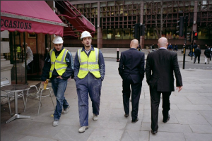
He shoots polar opposites as seen below with ‘men at work’ I especially like how the 2 sets of men are walking in different directions – this adds to the impact of the contrast. (I also love the fact that the 2 builders have hard hats on and the 2 suited men are both bald…this adds a feel of consistency and symmetry)

screen-shot-2016-10-07-at-10-06-35

Being armed and ready at all times for that split second opportune moment must be difficult, but Nick never fails to produce interesting thought provoking images, like the one below of a passer by unknowingly mimicking the pose of the model on the side of the bus:

screen-shot-2016-10-07-at-09-56-22

It really does go to show that with a bit of creativity, patience and effort – the general public can pose as subjects for some really great images.

Valerie Jardin

I was unaware of Valerie Jardin’s work until my tutor pointed me in the direction of her website:

http://valeriejardinphotography.com/2wl3j0hihjcwwyj90o690pxj46umdv

Valerie is renowned for her street photography, which seems to have taken her all over the world. What I really admire about her work is that it comes across as so effortless. She shoots predominantly in black and white which instantly adds an air of old fashioned glamour. Her shots have great clarity, with no noise, making them appear silky and smooth.

I love that she seems to shoot everyday objects and events – there’s a specific shot of a man with a cigarette in his hand, writing in a cafe while there’s an out of focus coffee cup in the shot – depth is added by focussing beyond the cup, while the cup itself adds an aesthetic element:

screen-shot-2016-10-06-at-13-58-51

There’s also a shot of a man reading his book on a bench. Nowadays people think they need to add some sort of action or interesting subject for a photograph to be interesting and current, but Valerie has proved that this isn’t so. Simplicity, done right, can be as impacting as a bustling crowded street scene. The photo uses the rule of thirds, and has strong lines. The contrast between the white pages of the book and the bench against his black garments really make it stand out.

screen-shot-2016-10-06-at-13-57-31

One of my favourite shots is of a group of nun’s photographing a building on their mobile phones – what a gorgeous concept. It incorporates both old and new – old being the traditional attire and ancient history of their religious beliefs, and new being the up to date technology in which they capture and record their memories.

I had a similar experience when travelling around Asia. While in Thailand I saw a Buddhist Monk carrying a laptop – I was briefly baffled by the contrasting visuals; the traditional robes and barefoot appearance of the monk juxtaposed by the swanky apple laptop under his arm.

screen-shot-2016-10-06-at-13-58-41

Experimenting With Welding Glass….

I’ve previously mentioned wanting to do long exposure shots but as of yet I don’t own a neutral density filter. After researching online I found multiple articles that claim a sheet of welding glass can give the same results.

So, I purchased a sheet off eBay (shade 12, as dark as possible) for just £1 – this has got to be worth a try!!

The set up was a bit fiddly – it involved numerous rubber bands and I had to focus my shot before attaching the glass over my lens, as there was no way I could actually see through the glass once on.

The glass is tinted green – there’s no way around eliminating this from the image – so shooting in RAW is a must. It’s the only way to process the image to the correct colour.

I experimented with shutter speed times ranging from 3 minutes to 13 minutes.

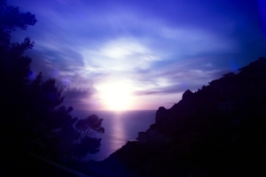
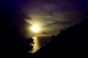
Here’s 2 of my favourites, both with minimal editing – just white balance correction and some minor hue alterations.

They’re of the same view, but at different times before sunset, resulting in a noticeable difference in colour.

As I was shooting a sunset directly in front of me, the movement wasn’t too drastic, and it was a very still evening so the clouds were fairly motionless but it was a great experiment.

I’m really pleased with the outcome. Not bad for a quid….

long-ex-1

long-exp-2

The Importance of Ethics in Photography

I have been reading articles on this subject since stating part 4 and found a very interesting piece written by Nasim Mansurov. It covers all areas where editing and manipulation could be ethically questionable.

Here’s the article:

https://photographylife.com/the-importance-of-ethics-in-photography

The section on portrait and fashion photography really demonstrates how much almost everything we see in magazines and media is edited.

It also raises the idea that although most photographers are adamant they do not edit their material, the fact of the matter is they do tweak it here and there – white balance, colour correction, contrast and brightness etc. The nature photography paragraph is a great example of this.

There’s an extremely fine line between editing to ‘correct’ and editing to ‘change’.

Research: HDR to B&W…

I previously voiced my opinion on HDR (high dynamic range) photography on here, stating that done subtly I like it, but done too much and it can start to look too contrasty and cartoon-like. (Click here for the post)

I wondered, however, how HDR shots would look when converted into black-and-white. I was especially intrigued to see the effects of the sky and clouds. The expansive range must add a significant amount of depth and tone.

As i’m not a huge fan of HDR I don’t have many images in my archive (this is something I will experiment with though) so here’s several examples that popped up on Google search.

209bd67656190fa0cdd4fe3ac3475c09

lake-hdr-gld

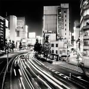
martin_stavars-nightscapes-tokyo12

maxresdefault

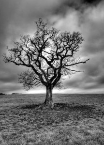
I think black and white HDR, even when done to a moderately high extent, is actually a great creative tool in adding layers and tones to black-and-white photography. There were a few examples that appeared a little ‘over done’ and had that unrealistic feel to it, but on the whole I quite like it.

An HDR black-and-white image that really caught my eye while researching comes from photographer John Hobson: (http://johnhobsonphotography.com/category/hdr/)

20070219-CoaleyTreeHDR

I love the dramatic, ominous mood he’s created using HDR, especially how it’s effected the sky. This is definitely a tool I’ll be keeping in mind for black-and-white photography, and I may even attempt to include a bracketed shot in my upcoming assignment.


Photographer: Michael Kenna

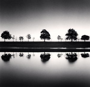
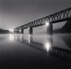
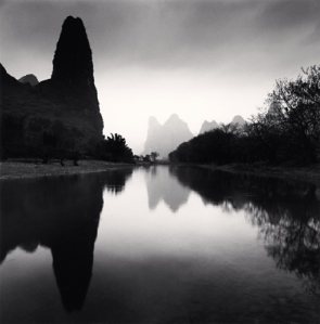
I’ve recently discovered the work of English photographer Michael Kenna. Like Ansel Adams, the majority of his portfolio is landscapes. Kenna is known for producing exposures of up to 10 hours, usually at dawn or at night  – which produce silky, soft looking images – a contrast from the stark dramatic images previously researched on Adams. His images that incorporate water are often long exposure shots which is a technique used to remove the movement of ripples and waves; creating soft, smooth water, it almost looks like mist.

michael_kenna_supports_de_jetee_france_2560x1440

1407712979257

michael-kenna-11

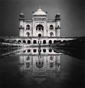
Kenna also uses water as a reflective tool which adds symmetry to his images. Something I feel works extremely well in black-and-white.

artlimited_img7582089-01

Safdar Jang, Study 1, Delhi, India, 2006

dbb283d1-0618-48b8-8177-3bd31941cf31

Lijiang+River,+Study+7,+Guilin,+China,+2006

michael_kenna_111

Having experimented with the starker, more dramatic black-and-white effects, i’d like to try and create softer images in the style of Kenna.

Photographer: Ansel Adams

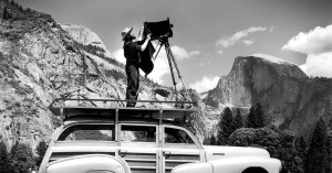
Having recently returned from a trip to Yosemite National Park I’ve been studying possibly the most famous photographer to produce imagery of Yosemite – Ansel Adams. His work is also extremely fitting for this part of my course – monochrome.

Ansel-Adams-Portrait-Inner-Banner1

Ansel Adams was an american landscape photographer, famed for his stunning black and white images of The American West. Together with Fred Archer he devised a process known as the ‘Zone System’.

The Zone System provides photographers with a systematic method of precisely defining the relationship between the way they visualize the photographic subject and the final results. Although it originated with black-and-white, the Zone System is also applicable to digital photography. Adams himself anticipated the digital image. As with color reversal film, the normal procedure is to expose for the highlights and process for the shadows.


For a full breakdown of this method click here to go to Wikipedia.

Adams also founded the photography group known as Group f/64 along with fellow photographers Willard Van Dyke and Edward Weston.

The New York Times published a great article on Group f/64, please click here to view it.

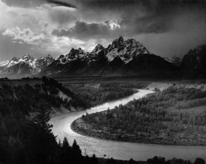
What struck me the most with Adams’ photography is just how bold and tonal his images were. They almost look processed. Being able to produce such sharp, moody contrasting images using the equipment available back in the mid 1930s is inspiring. It really has opened my eyes to just how much control photographers have over producing the visualised effect desired. It’s simply not a case of putting your DSLR into monochrome mode, or converting a colour image into black-and-white in post processing software. It’s about being conscious of the huge range of variables: tones, highlights, shadows, textures, form, shape, colours, depths, low key parts, high key parts…The list goes on!!

Adams_The_Tetons_and_the_Snake_River


5010114-u-2

adamslg