Category Archives: The Art of Photography

Exercise: How Space Changes With Light

For this exercise I have to return to the same location at different times of the day or different weather, to see how the light changes. It is important to take note that dusk and artificial lighting can create even greater differences.

The first shot was taken early in the morning, with the winter sun shining strongly from the right. The details of the plant beds on the right are almost lost, and there’s strong shadows cast on the wall. If I were photographing the garden in this light iId change my positioning to capture more of the mid tones.

Later in the morning there was some light cloud which has eliminated the strong shadows allowing more of the flowers/beds to be visible.


Just before the sun started to set, I’d added an artificial light source (the kitchen light, evident on the seat of the chair) which adds some depth.

Finally a mixture again of natural and artificial light. Without the artificial light the garden was almost invisible.

I’d like to try this exercise again but using an indoor space as I think my results would be more evident. Besides the first picture, I wouldn’t necessarily consider changing my position in any of the other images. Had I used an indoor space I think the varied shadows would have been greater and more interesting. Perhaps I should have removed the artificial light used in image 3 to portray stronger results. Still, I am very aware of how light can vastly change a space, requiring us to consider angles, viewpoints and composition in order to capture a space successfully.


Assignment 5: ‘Narrative & illustration’ Amended

The main issue my tutor had was that I didn’t get ‘the money shot’ and I completely agree. Originally I never intended to get this shot, and wanted to demonstrate more of what goes on ‘behind the scenes’. I’ve touched on this – but with some editing it could be better, and more in-depth.

I don’t feel that my images need altering and it’s not the kind of thing you can revisit, but more the layout and wording of the ‘article’. I’m no magazine designer either, so my skills in that area are somewhat limited. However, i’ve made all the relevant changes that I was advised to.

Front cover

page 1

page 2

page 3

page 4

page 5


Assignment 4: ‘Lighting Techniques’ Amended

The key issues raised by my tutor were:

  • There were a couple of colour balance issues but nothing too bad. I would revisit the images for colour and texture before printing to make sure your colour balance is correct. At the moment the first colour image has a blue/magenta cast, the second a yellow cast, the first texture image a yellow/green/cyan cast and the last texture image looks a little dark.

I have gone back over my prints and corrected these issues and am much happier with the results.

Colour:

colour black

colour white


In both shots, regardless of the colour of backdrop the alterations have made the many different shades of wood much more apparent.

Texture:

texture white

Again this was more of a colour issue, and the alterations have greatly improved the shot.

My camera was producing some very unusual shutter speeds, and this was not in fact a result of my conversions. I have however, revised all speeds to a more understandable display as rightfully suggested by my tutor. (At the time of shooting I was very confused by the readings I was seeing on the LCD screen.) The amendments are:

Colour:

White – 0.1 seconds

Black – 0.6 seconds

Form:

White – 2.5 seconds

Black – 3 seconds

Shape:

White – 0.6 seconds

Black – 0.6 seconds

Texture:

White – 0.4 seconds

Black – 0.6 seconds

Assignment 3: ‘Colour’ Amended

Overall my tutors comments were positive and only offered a few ‘tweaks’ to the pics.

  •   The yellow colour accent works, although perhaps not totally successfully. As you note, the yellow flower is a little small. Perhaps in a large print it would stand out more, but I think it is more the fact that it is so overwhelmed b y the much larger plant coming out of the wall above it. The pink accent however is much more effective –it stands out and draws the eye straight to the flower.
  •   In a couple of the photographs you are looking up at widows. This works well in terms of the assignment but in terms of producing a successful photograph, you might get better results by moving back some way and using a longer lens. This will help to reduce the amount you obviously have to point the lens upwards, and so reduce the perspective distortion a bit. Ideally you would want to be on the same level as the window, but I realise this is a tricky proposition. The one with the blue window is also not straight (but I do like the little bits of greenery creeping into the top of the frame!)

For accent i’ve cropped the original shot to make the yellow flower much more prominent, it may still be slightly small, but I think it works well as an accent as the rest of the shot is fairly bland. It was far too lost in the original shot. It helps that it’s just off centre, as your eye is drawn to that area of the image almost straight away.

yellow accent


For the complimentary colour shot with the blue window i’ve rotated it slightly. I didn’t want to crop the foliage out as I like what it adds to the picture.

It’s still slightly off centre, and this was a problem with my positioning and obstacles in the way.

orange blue

I am very aware that several of my shots could have benefitted from using a telephoto lens (i’m yet to add to the collection) for example, as this would have significantly reduced the upwards angle that the shots have. It would have helped to reduce the distortion. However, I made the most out of the equipment I have, while also trying to get as high up as i physically could.


Assignment 2: ‘Elements of Design’ Amended

The main points raised by my tutor were:

  • Single Point: The grape photo works and the eye is drawn to the grape but I do wonder if you would not have been left with a cleaner photo that responded more directly to the theme if you had removed the grape from the stalk. I reviewed the contact sheets and didn’t see this option. As the rest of the photos are all presented in a cleaner, more commercial manner, the grape picture would have fitted into the series more without the stalk.

Single point revised:

I agree with my tutors comments and decided to go for a cleaner shot, removing the stalk. I think it works much better as there is zero confusion and one single point, as required.

Grape A.2 final

  •  Two Point: I agree that this is a successful picture and would fit a lifestyle magazine/website well. I wasn’t totally convinced by it representing ‘two points’ though –the bowl and contents is one point –perhaps a drink or napkin/cutlery to the side would have given you a second point?

I decided to steer away from the bowl of pasta shot (due to deadlines and a broken studio light) and try to incorporate and object that can deliberately be made into two points.. It follows on from the food theme, and also from the red grape. I like the reflection of the cork. I also wanted to see if you could have a two point picture with 2 very different sized objects. I think this has been successful.

Two points revised:

2 points low res

  • Several Points in a deliberate shape: I had a couple of issues with this image. The first was procedural –you have included two slightly different variants in the submission but just one in the assignment overview. When it comes to assessment you will want to present just one. The more pressing issue is the depth of focus isn’t really working –having the blurred piece of sushi in the front is distracting to the viewer –the eye is taken straight to this one and you end up hunting through the image to find what is in focus. Perhaps if the front piece was the one in focus and the others soft it would be more successful? Compare this to the walnut photo where you have the dominant front half of the walnut in focus and you can see where that image is a success compared to the sushi image.

Several points in a deliberate shape revised:

I’ve taking my tutors comments on board and re-shot the sushi image – with the 3 prominent sushi rolls (in the deliberate shape) in full focus, with a softer focus on all surrounding sushi rolls. I feel this has produced a much stronger image.

Sushi 1 low res

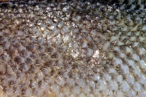
  • Pattern: You have some camera shake here –you can see when you blow the photo up that the scales are a bit soft because the lens has moved slightly. This is easy to avoid, just make sure you are using a shutter speed fast enough to eliminate the issue if working handheld (as a rule of thumb, at least 1/the focal length of the lens, so 1/60th for a 50mm lens, 1/250th for a 200mm lens etc)

Pattern revisited:

This was generally a hard shot to get right as I was using a macro add on ring (good budget buy) but it’s results can be blurred. I re-visited the shot, this time with a tripod to eliminate any shake. I think the front on positioning makes a cleaner and more pleasing composition.

pattern 2

End of ‘The Art of Photography’ module….

I’ve now submitted assignment 5 to my tutor and am waiting for my feedback. In the meantime i’m going to revisit the previous 4 assignments and make changes in preparation for formal assessment. Unfortunately last year my laptop crashed and I lost my work for assignments 1 & 2, but not to fear, I still have the final pictures I submitted on here. Any thing that is missing I will re-create (I don’t want to start making too many changes or new pics, so will keep this to a minimum.) I’m very aware that going back to these past assignments will be a huge eye opener as to how little technical knowledge I had! It will be hard to not pick my work to pieces, as I now have so much more technical experience. Once I feel I’ve made the necessary changes I aim to submit my work for formal assessment.

All 4 assignments will be amended and uploaded soon.

Assignment 5: Narrative & illustration

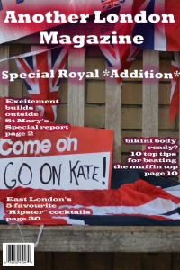
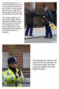
‘In this final assignment imagine that you are about to illustrate a story for a magazine. You have a cover to illustrate, and several pages inside (create between 6 and 15 images – you can choose). Even though there may be no text, you should write captions (of any length) to explain and link each picture.’ Below is my magazine in PDF format, and beneath that is the individual images themselves.

Not Another London Magazine

DSC_0021 DSC_0022 DSC_0062 DSC_0073

DSC_0192

DSC_0219 DSC_0220 DSC_0225

DSC_0235

DSC_0237

DSC_0261

DSC_0301

DSC_0317

DSC_0345

All of the photos used in the final selection have had minimal, if any post processing. I felt that an article such as this would not require much editing, and wanted to show my narrative in as real a form as possible.

I really enjoyed this assignment and it challenged me in several areas:

Photographing people: In the previous exercises and assignments i’ve steered away from photographing people (somewhat subconsciously), and was adamant that I would avoid it no longer. A majority of the images submitted and also the images that didn’t make the final cut were of people. Some aware, some not. Pushing my boundaries on this was extremely rewarding and gratifying.

Photographing in a limited space: With the location being so squashed in (half a street, if that) it was challenging to find the right angles and viewpoints, while also creating varying shots.

Photographing with speed: Much of what I wanted to capture was not static. People were moving around so quickly and erratically that I had to take my shots fast – this resulted in some focusing issues, and a paparazzi man told me that more often than not photographers use auto mode and auto focus at scenarios such as this one. (I tried to avoid this as much as possible).

Photographing in a crowd: With the huge crowd getting larger it was hard to get steady shots – people are bumping into you left right and centre, or crossing right in front of your shot.

Photographing in the ‘split second’ I captured many ‘moments’ in this assignment. Moments that once passed would not be repeated. This meant I was under a fair bit of pressure. It was not like previous assignments where I could set up the scene myself, or tweak it. This environment was totally out of my control, which was rather exhilarating!

Tutor Feedback:

SCAOP5

Assignment 5: round 2…(TAoP)

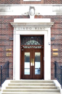
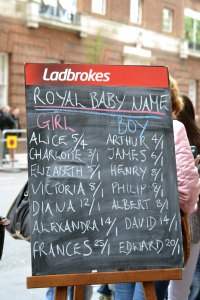
After my first attempt with this assignment didn’t quite reach my expectations I was looking for a strong plan B; which I found in the form of the Royal Baby. With such a big historical event about to unfold around me I knew it would make for a great magazine, and more importantly a great narrative.

First things first, I needed to familiarise myself with the location. St Mary’s Hospital is located right by Paddington tube station – so access was relatively easy (manoeuvring through the crowds, that is) and is one stop away from my office which was a blessing, as I could be on baby standby with all my equipment at work with me.

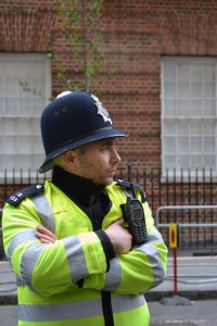
I wanted to gradually build up my narrative and illustrate the growth of interest/crowds/press and police. This required going back almost on a daily basis from the moment the due date was leaked. This could have been hindered by the fact that I have a full time job and can’t drop everything in an instant.

Having assessed the location several times, I made a mind map of where to get good shots, and from certain angles; bearing in mind that the public can only really access a street meant that this was limited, but not impossible.

I took HUNDREDS of practise shots. I had read that the paparazzi and press journalists often put their cameras on auto mode (sometimes auto focus too) to get their shots. I was reluctant to do this, as I wanted to put my skills from this part of the course into practise!!

I had jotted down a rough idea of how I wanted my ‘article’ to look, and the order of photographs etc, so now I needed to focus and actually get snapping!!

Assignment 5 attempt #1

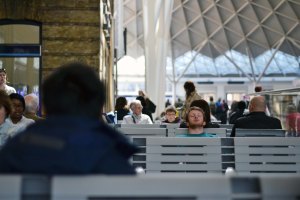
The OCA handbook advised taking time over this assignment, and careful planning. After weeks of throwing ideas around my head I decided on photographing a standard London commute, and capturing people on their journeys – where were they going to? Where were they coming from? Could I narrate their mood using body language or facial expressions?

Photographing people is something that I find rather daunting – where is the boundary for being intrusive? What if the person does not want to be photographed? From the get go I was not going to photograph any children whatsoever. Being crammed on a tube carriage meant that I had to be up-close and personal – something that didn’t come naturally to me. Even using my 50mm prime lens felt too intrusive. If you’re lucky enough to get a seat on the tube, you’re usually sat in a row facing your fellow commuters. This meant that eye contact was at a high, and eye to lens contact was even more so. Even trying the ‘shoot from the hip’ method was not producing the results I was looking for. Had the train been near to empty this may have been different. This was the first of many obstacles I encountered.

The second was camera shake. I hadn’t anticipated just how hard it would have been to get a still shot – the tube jiggles you around much more than I was aware of (usually i’m in my own world listening to music, not noticing how much I move) and this became a BIG problem. I could alter my shutter speed setting, and then crank up the ISO but I didn’t want to produce grainy pictures.

This brings me on to the lack of light. Duh, I’m underground – so there’s firstly no natural light, and secondly, the strength of the artificial light at times was weak (tunnels were a no).

The biggest problem was that I was banned by security for using my tripod anywhere in the stations (health and safety….apparently) which just emphasised my struggle to capture what I had imagined and wanted to produce. I feel that what I envisioned in my head was not unrealistic but unattainable due to these set backs.

As a result of the above I have decided on doing the same sort of theme, but in an easier environment. I still want to push my boundaries of photographing people, but maybe not when they’re sat 2 feet opposite me, looking at my camera like i’m paparazzi.

I did, however, manage to take a handful of interesting shots, which I have included below.

I learnt a great deal from this ‘failed’ shoot, and wonder if i’d researched it a little more if I could have avoided these problems – perhaps by heading to the outer city where it’s not as busy and the trains are emptier, also shooting on over land routes so I can use more natural light.

couple fan long exp mans head people

sleeping tunnel

policeman

Exercise: Juxtaposition (TAoP)

For this exercise we can either choose a still-life approach, or a larger scale shot. I chose the still-life and am required to take any book I like and make a suitable illustration using several elements.

Having research other fellow OCA students I found it was very common for people to choose fiction books, most of my home reading jumps from photography, to crime novels, to Marilyn Monroe books…I was at a loss!! The only other books are cookery books….so I decided on illustrating one of my favourite books: ‘Chinese Food Made Easy’ by Ching-He Huang.

Juxt

A simple still life using some of the most fundamental ingredients for Chinese cooking. For this shot I used my photographic studio with natural light (positioned next to large window) and used a reflector to the left hand side.

As a quick example of how it may look with text on, I threw together a very basic idea with photoshop:

Juxt cover